


I was very fortunate to recieve an email on new years day from a very inspirational designer , who gave me some advice on how
Finding Focus: Navigating Life’s Frequencies for a Fuller Experience In this blog post, I’ll share my insights on staying focused, making the most of the
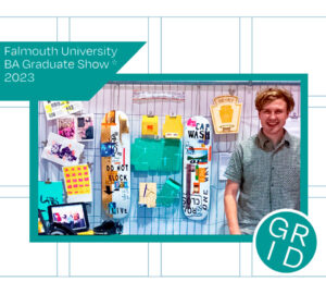
Was really happy to be part of the Independent Falmouth graduate show in London this year, where some students from all courses got to present